

Can POSM emphasize the quality?
Manufacturers of alcoholic spirits quite often use cardboard racks to strengthen their presence in stores.
This is particularly evident in "in&out" actions. These are usually made from high-quality materials emphasizing the advantages of the product. In this case, an interesting graphic in black aims to emphasize the quality aspirations of the product.
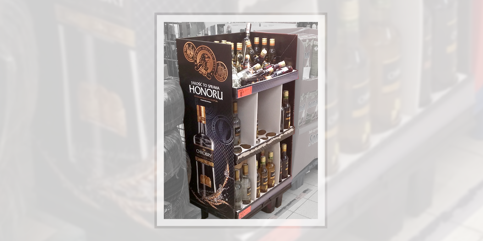
An interesting composition perfectly displays the picture of the product, and the medals are at first glance associated with the kind of awards granted at trade fairs. This impression, however, is altered at the detail level - the main slogan with the font size emphasizes "Honor", and the smaller words explain that it is about "Quality".
Then the real meaning of the medals becomes clear - these are not medals, but product accents: "Polish grain", "Coal filters", "Manufacturer's name and year 1827".
Generally, it was probably more about the "impression of a high-end product" and it's a pity that communication to the shopper did not remain consistent at the "Quality" level.
The "Vodka" and "Honor" cluster seems to be risky, and additionally, one must remember the specificity of the place where the stands will be used. In this case, it lies between "tires" and "detergents" in Biedronka (the largest discount chain in Poland).
