

Which chain prepared better communication on POS materials to customers?
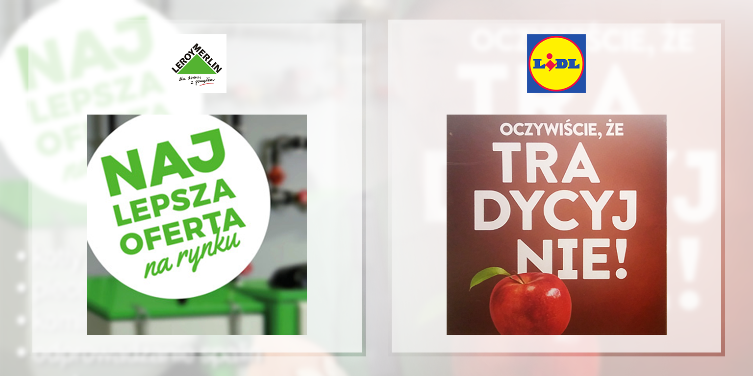
This time, Lidl, or actually its creative agency, have lost miserably. The overlays on the gate at the till are good looking, but the most important thing, which is the readability of communication, have been forgotten. Research shows that eye contact of customers with the advertisement in the store takes 1-2 seconds and that is why the readability of communication is so important. The heavily stamped word TRA - DYCYJ - NIE (en. traditionally broken to 3 lines), in this form is not easy to read. What's more, the photo of an appetizing apple that catches attention is located next to the word NIE! (en. NO!). Leroy has prepared its slogan perfectly and their offer is simply NAJ - LEPSZA (en. the - best). Congratulations to the creators.
